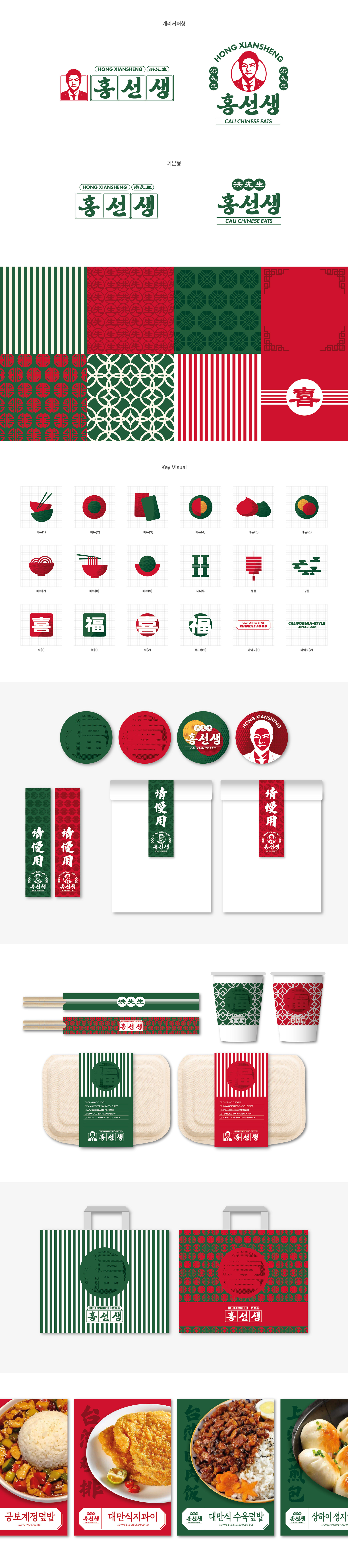
캘리포니아 중국가정식 브랜드 ‘홍선생’의 브랜딩을 진행했습니다. 홍선생의 로고는 캐리커처 스타일의 아이콘을 중심 요소로 활용해 브랜드의 개성을 직관적으로 표현했으며, 궁체 스타일을 현대적인 감각으로 재해석해 전통적이면서도 세련된 분위기를 담아냈습니다. 또한 영문과 한자를 조화롭게 배치해 감각적인 브랜드 이미지를 완성했으며, 중국 특유의 무드가 느껴지는 레드와 딥그린 컬러를 중심으로 전체적인 컬러 시스템을 구성했습니다. 더불어 로고와 어우러지는 패턴과 컬러 아이콘을 키비주얼로 함께 개발해 패키지, 포스터, 스티커 등 다양한 그래픽 요소에 일관되게 적용함으로써 브랜드 전체가 하나의 통일된 무드로 느껴질 수 있도록 작업했습니다. I worked on the branding for ‘Hong Xiansheng,’ a California-based Chinese home-style cuisine brand. The logo was designed around a caricature-style icon to intuitively express the brand’s unique personality, while traditional Gungche-style typography was reinterpreted with a modern sensibility to create a refined yet classic mood. English and Chinese characters were harmoniously combined to complete a visually distinctive identity, and the overall color system was built around deep green and red tones inspired by the atmosphere of Chinese culture. In addition, supporting patterns and color icons were developed as key visuals and consistently applied across packaging, posters, stickers, and various graphic materials to create a cohesive and unified brand experience.