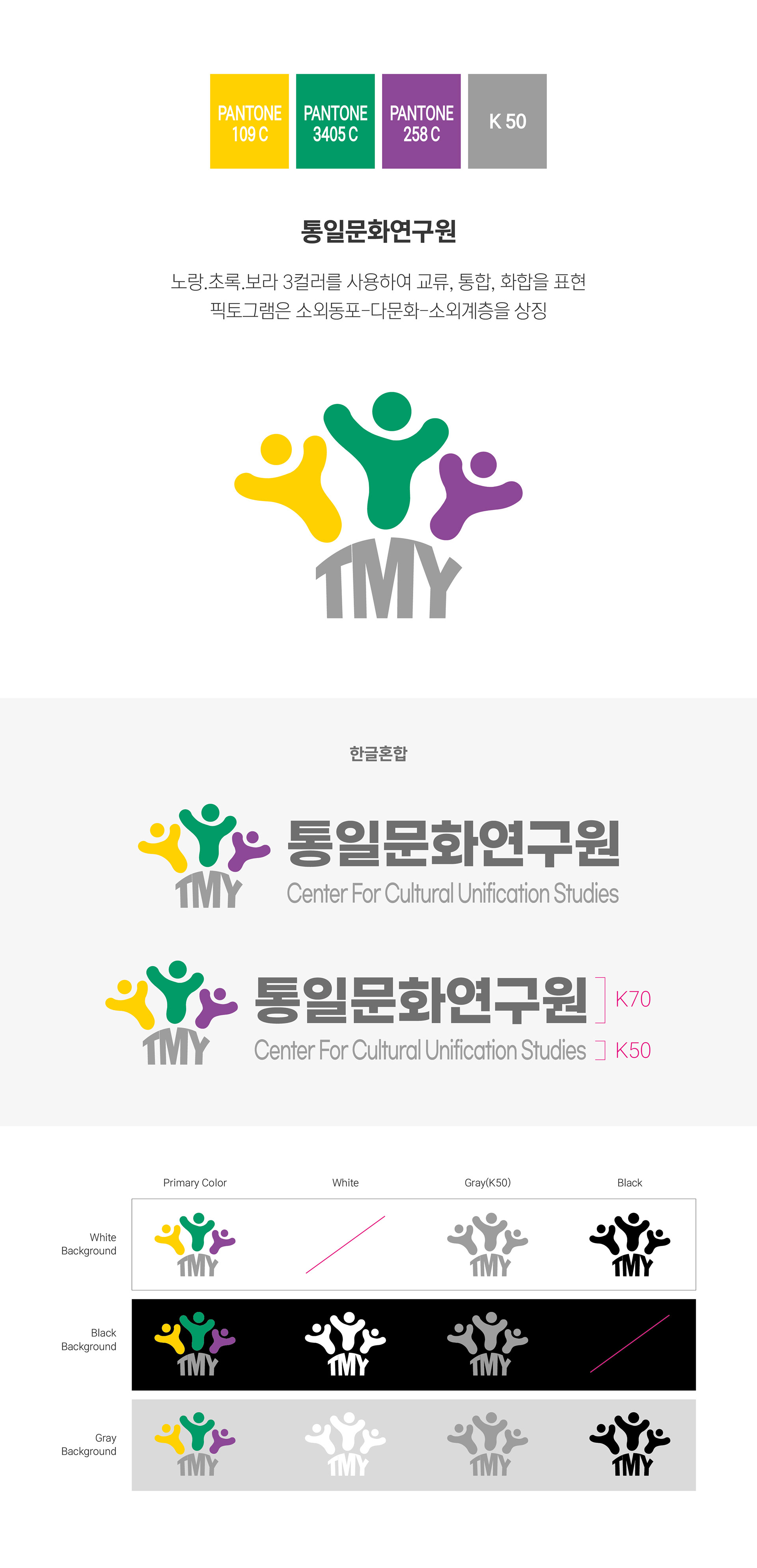
통일문화연구원(TMY)의 로고 디자인을 진행했습니다. 통일문화연구원의 핵심 가치를 시각적으로 담아낼 수 있도록 로고를 디자인했습니다. 브랜드 컬러로는 노랑, 초록, 보라를 사용해 교류, 통합, 화합의 의미를 상징적으로 표현했으며, 심볼에 활용된 사람 형상의 그래픽은 소외동포, 다문화 가정, 그리고 소외계층을 의미합니다. 서로 다른 구성원들이 하나의 공동체로 연결되고 어우러지는 모습을 담아, 통일문화연구원이 추구하는 포용과 연대의 가치를 직관적으로 전달하고자 했습니다. I designed the logo for the Center for Cultural Unification Studies (TMY). The logo was created to visually represent the organization’s core values and mission. Yellow, green, and purple were selected as the primary brand colors to symbolize exchange, integration, and harmony. The human figures used in the symbol represent overseas Koreans, multicultural communities, and socially marginalized groups. By bringing these elements together within a unified visual form, the logo communicates the values of inclusion, connection, and solidarity that the Center for Cultural Unification Studies seeks to promote.