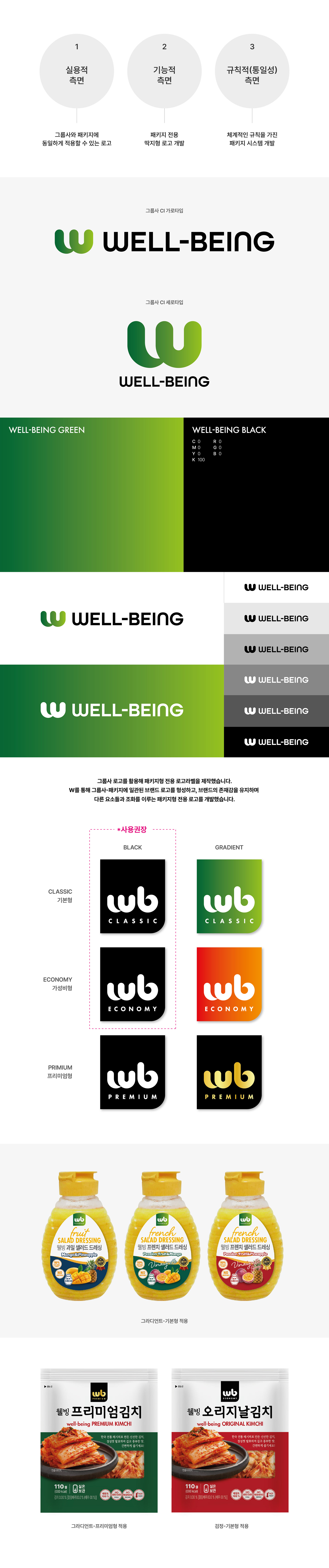
필리핀을 기반으로 한국 식품을 판매하는 식품회사 ‘웰빙에센셜’의 브랜딩 및 패키지 가이드를 진행했습니다. 웰빙에센셜의 로고는 W 형태의 끝부분에 한국적인 궁체 스타일의 붓 터치 느낌을 더해, 단순하면서도 브랜드만의 개성이 느껴질 수 있도록 디자인했습니다. 심플한 구조 안에서도 W가 가진 상징성을 강조해 차별화된 이미지를 전달하고자 했으며, 패키지 환경에서 브랜드의 존재감이 자연스럽게 드러날 수 있도록 전체적인 시각 시스템을 구성했습니다. 또한 기존 그룹사 로고를 패키지에 그대로 적용할 경우 복잡한 요소들 사이에서 로고의 인지성이 약해질 수 있다고 판단해, W 형태의 핵심 요소를 활용한 패키지 전용 로고를 별도로 개발했습니다. 이를 통해 그룹사와의 연결성을 유지하면서도 패키지 내에서 브랜드 아이덴티티가 일관되게 전달될 수 있도록 디자인했습니다. I worked on the branding and package guidelines for ‘Wellbeing Essential,’ a food company based in the Philippines that distributes Korean food products. The logo was designed by applying a Korean Gungche-style brushstroke detail to the ends of the letter W, creating a simple yet distinctive identity with a subtle traditional sensibility. While maintaining a clean and minimal structure, the symbolic character of the W was emphasized to deliver a differentiated visual image and ensure strong brand recognition within packaging applications. In addition, since applying the original group company logo directly onto packaging made the overall layout feel visually crowded and weakened the logo’s presence, a dedicated packaging logo incorporating the signature W shape was newly developed. This allowed the packaging to maintain a consistent connection to the parent brand while creating a more balanced and recognizable identity across various package designs.