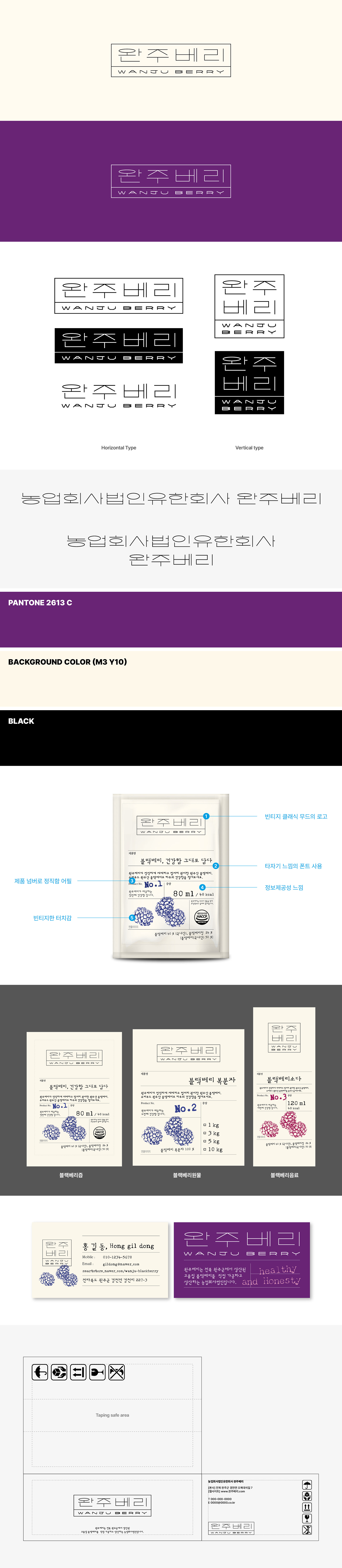
전북 완주군에 위치한 완주베리의 브랜딩 및 패키지 가이드를 제작했습니다. 완주베리는 전북 완주군에서 생산된 고품질의 블랙베리를 직접 가공·생산하는 브랜드로, 아날로그 감성이 느껴지는 타이포 로고와 레트로 무드의 그래픽을 중심으로 전반적인 브랜딩을 진행했습니다. 베리 제품에서 흔히 떠올릴 수 있는 올드하고 단조로운 이미지에서 벗어나고자 빈티지한 라인감으로 구성된 타이포그래피를 개발했으며, 한글과 영문을 조화롭게 결합해 클래식하면서도 트렌디한 분위기를 표현하고자 했습니다. 또한 브랜드 전반에 일관된 무드가 유지될 수 있도록 패키지 가이드까지 함께 제작해 완성도를 높였습니다. I worked on the branding and package guidelines for Wanju Berry, located in Wanju-gun, Jeollabuk-do. Wanju Berry is a brand that directly processes and produces high-quality blackberries grown in Wanju, and the branding was developed around an analog-inspired typographic logo and retro-style graphics. To move away from the old-fashioned and overly conventional image often associated with berry products, a vintage line-based typography style was created, combining both Korean and English lettering to express a mood that feels both classic and trendy. In addition, package guidelines were developed to ensure a consistent visual identity across the brand and enhance the overall completeness of the branding system.