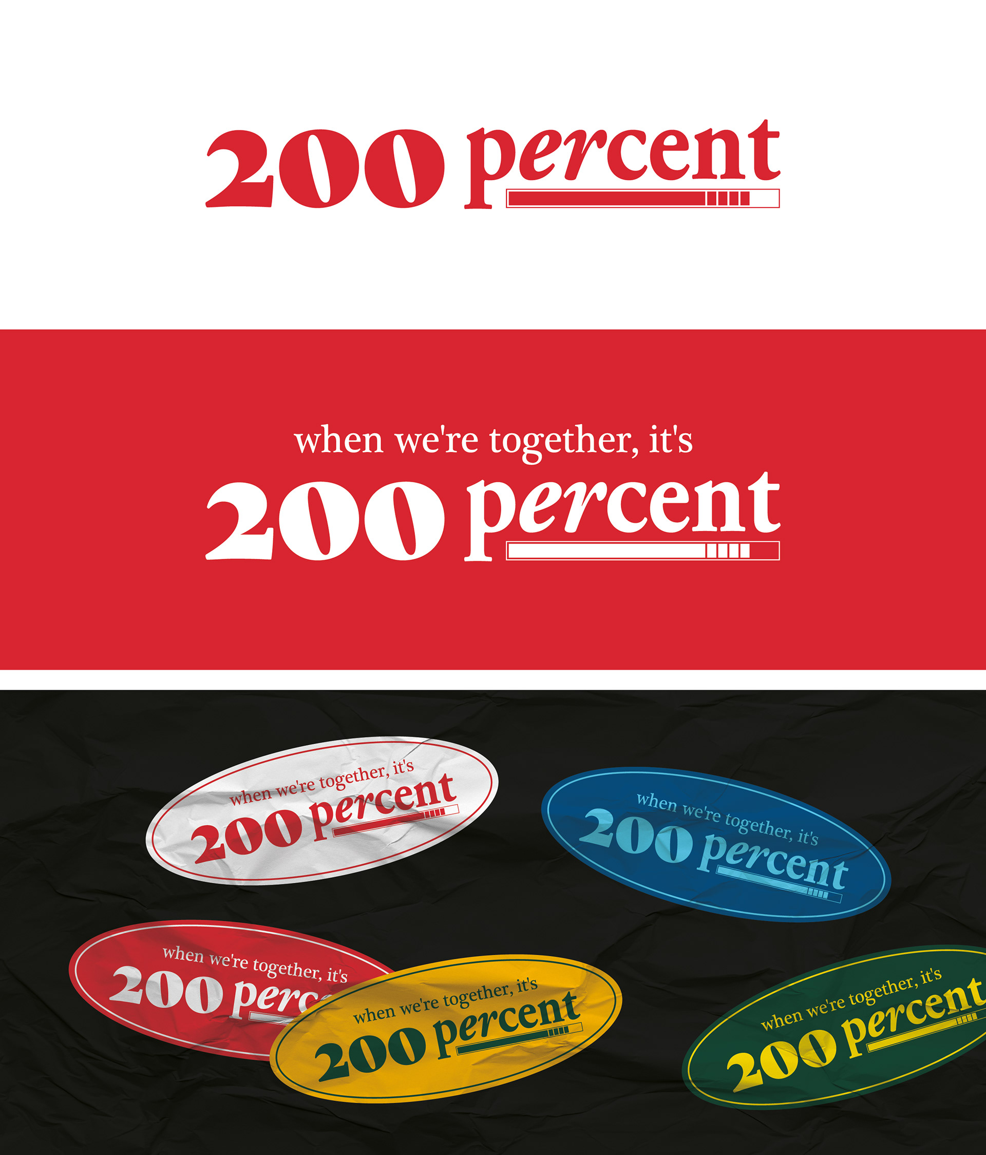
남양주에 위치한 200%의 로고를 제작했습니다. 서로 다른 산세리프 서체를 조화롭게 조합해 세련되고 트렌디한 무드를 담아냈으며, 고급스럽고 클래식한 인상 속에서도 젊고 감각적인 분위기가 함께 느껴질 수 있도록 디자인했습니다. 정제된 균형감 안에서 브랜드만의 개성과 존재감이 자연스럽게 드러나는 로고를 표현하고자 했습니다. I designed the logo for 200%, located in Namyangju. By harmoniously combining different sans-serif typefaces, the logo was created to convey a refined and trendy mood while balancing a luxurious and classic impression with a youthful and stylish sensibility. The design aims to express a polished yet distinctive identity that naturally highlights the brand’s unique character and presence.