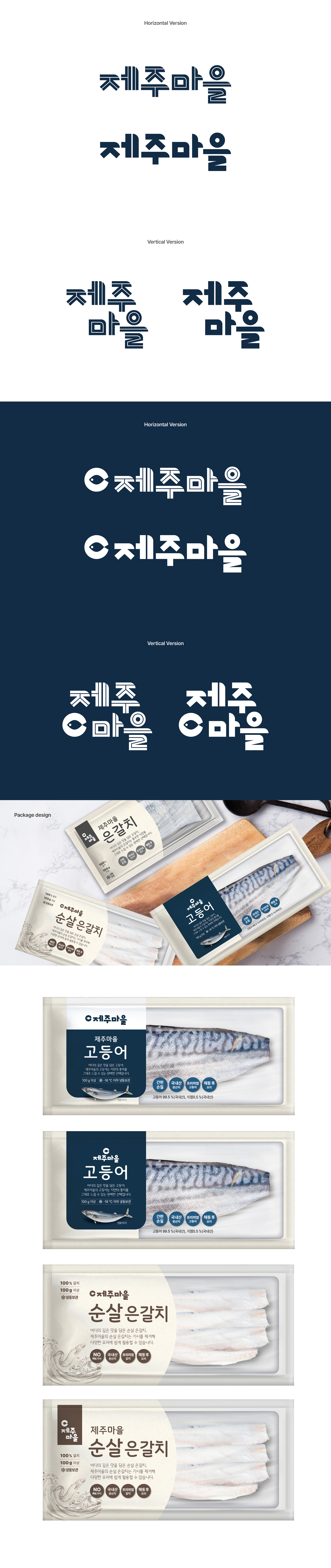
수산물을 판매하는 제주마을의 로고 및 패키지 디자인을 진행했습니다. 제주마을은 신선한 수산물을 전문으로 판매하는 브랜드로, 패키지와 온라인 상세페이지 등 다양한 매체에서 로고 활용도가 높은 점을 고려해 볼드한 형태의 한글 로고타입을 제작했습니다. 복잡한 요소는 덜어내고 직관적이면서도 깔끔한 인상을 전달할 수 있도록 디자인했으며, 패키지 환경에 유연하게 적용될 수 있도록 가로형, 세로형, 심볼 결합형 등 다양한 로고 타입을 함께 개발했습니다. I worked on the logo and package design for Jeju Maeul, a seafood brand. Jeju Maeul specializes in fresh seafood products, and since the logo is frequently used across packaging and online product detail pages, a bold Korean logotype was developed to create a strong yet clean visual impression. Unnecessary elements were minimized to keep the design simple and intuitive, while multiple logo variations—including horizontal, vertical, and symbol-combined versions—were created for flexible use across different applications and layouts.