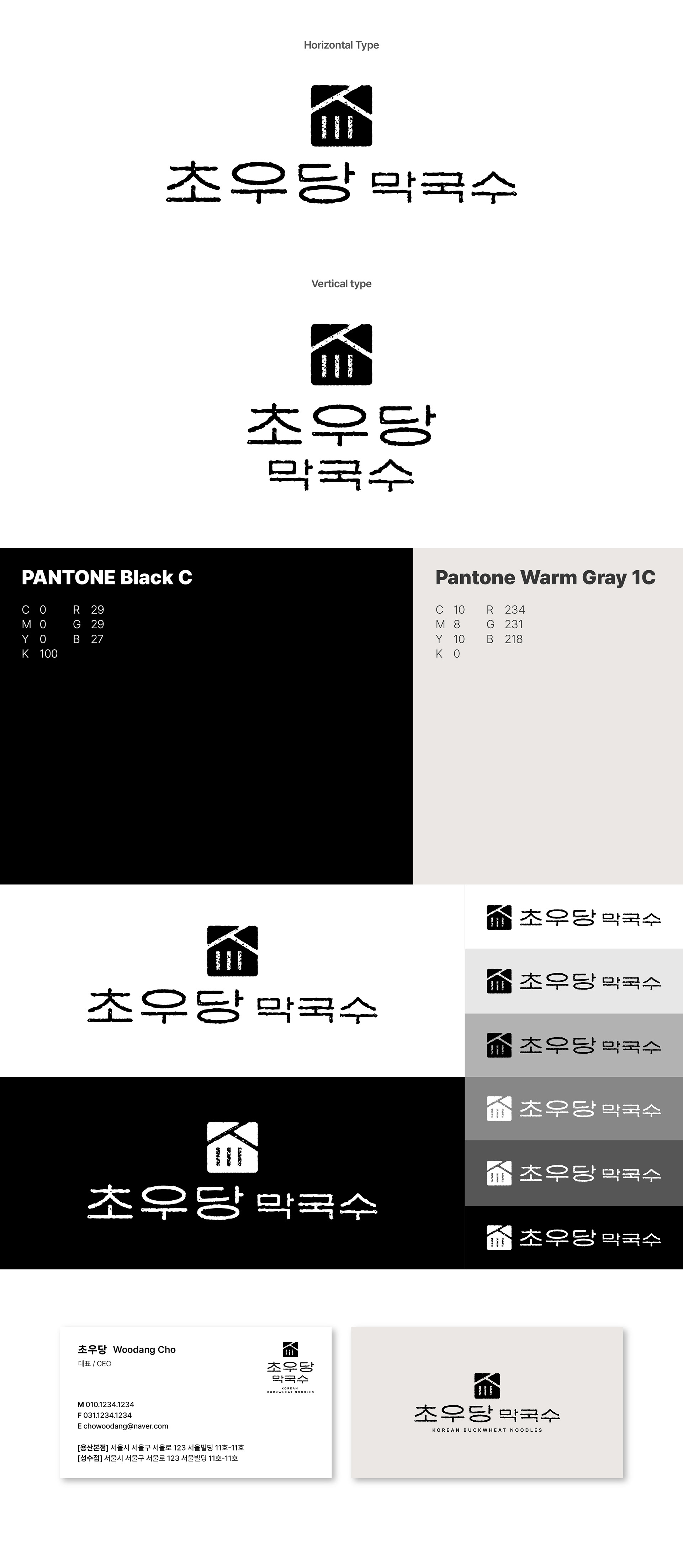
강릉에 위치한 초우당막국수의 로고를 제작했습니다. 초우당막국수는 전통적인 감성과 따뜻한 정서를 담아낸 브랜드로, 한국적인 분위기를 보다 친근하게 전달할 수 있도록 디자인했습니다. 가로폭이 넓은 서체를 사용해 여유롭고 정감 있는 인상을 표현했으며, 한옥의 형태를 스탬프 형식의 심볼로 제작해 브랜드의 전통적인 무드를 강조했습니다. 또한 목판에서 찍어낸 듯한 거친 질감의 타이포그래피를 활용해 한옥 심볼과 자연스럽게 어우러지는 아이덴티티를 완성하고자 했습니다. I designed the logo for Chowoodang Makguksu, located in Gangneung. The brand was designed to convey a warm and traditional sensibility while presenting a friendly Korean atmosphere. A wide typographic style was used to create a relaxed and welcoming impression, while the shape of a traditional Korean hanok was developed into a stamp-style symbol to emphasize the brand’s traditional character. In addition, rough woodblock-print-inspired typography was applied to naturally harmonize with the hanok symbol and complete the overall identity of the brand.