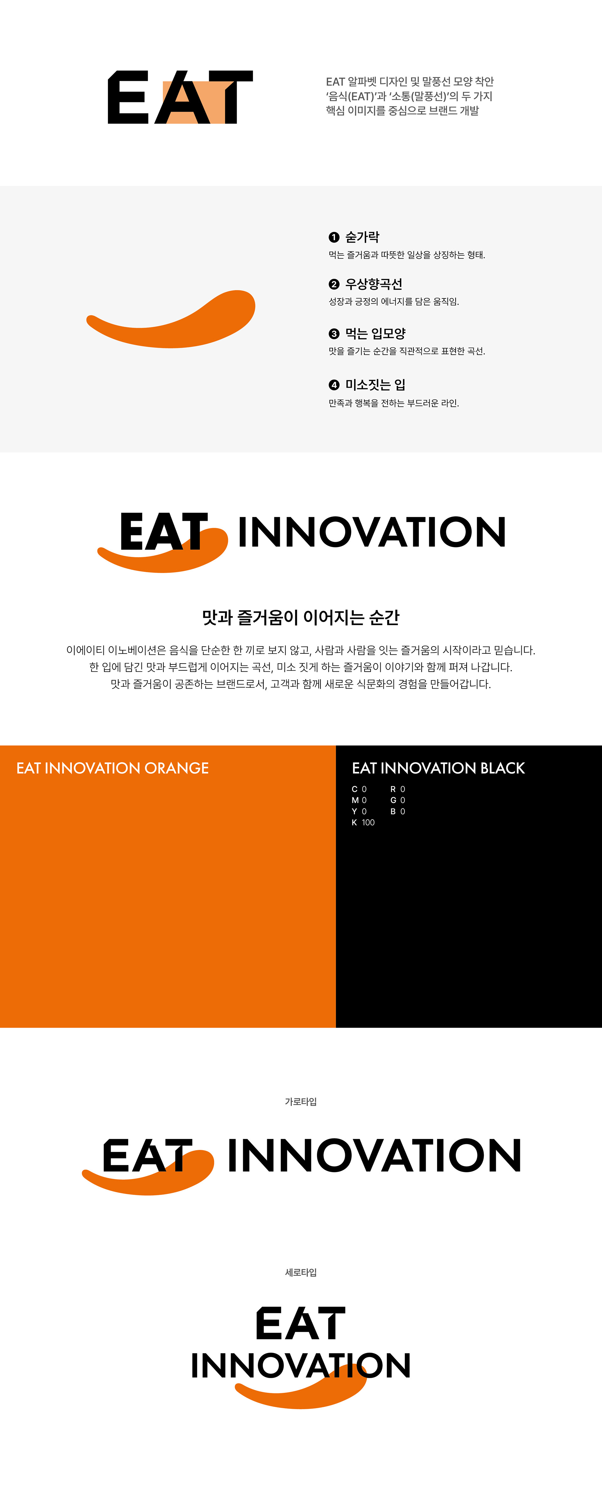
피자 프랜차이즈 브랜드 피자먹다의 그룹사 ‘이에이티 이노베이션’의 로고를 제작했습니다. 로고는 ‘EAT’ 타이포 안에 말풍선 형태의 요소를 자연스럽게 녹여내 음식과 사람 사이의 소통이라는 브랜드의 핵심 키워드를 시각적으로 표현했습니다. 또한 EAT이라는 단어에서 연상되는 즐거움과 긍정적인 에너지를 중심으로, 둥글고 우상향하는 그래픽 요소를 활용해 활기차고 생동감 있는 브랜드 이미지를 담아내고자 했습니다. 심플한 구조 안에서도 브랜드의 방향성과 유쾌한 분위기가 자연스럽게 전달될 수 있도록 디자인했습니다. I designed the logo for ‘EAT Innovation,’ the parent company of the pizza franchise brand 'EatPizza'. The logo incorporates speech-bubble-inspired elements within the ‘EAT’ typography to visually express the brand’s core message of communication between food and people. Centered around the positive and enjoyable associations connected to the word ‘EAT,’ rounded and upward-moving graphic elements were used to convey an energetic and lively brand image. The design was created to naturally communicate the brand’s direction and cheerful identity within a clean and simple visual structure.