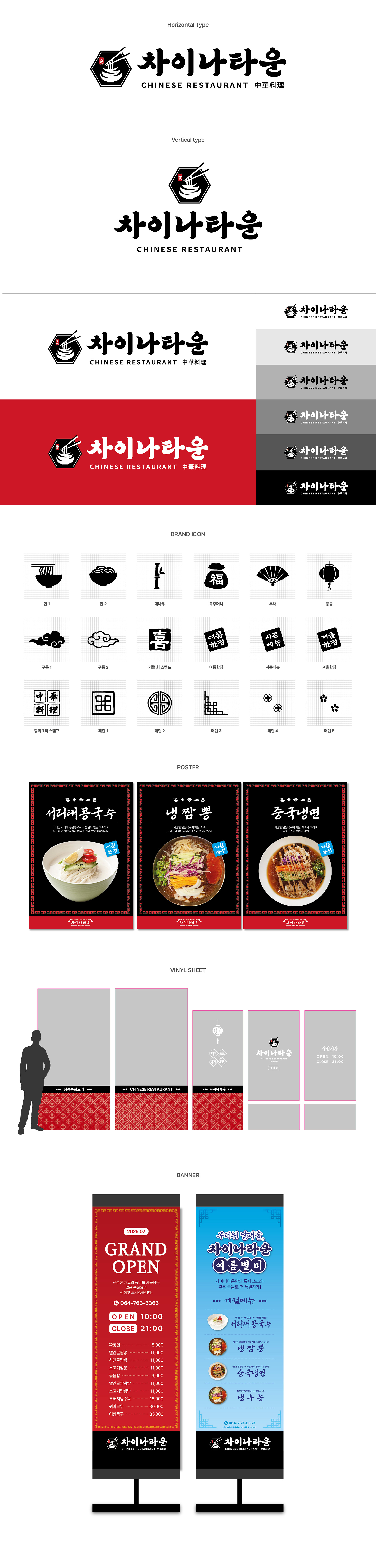
제주에 위치한 차이나타운의 브랜딩을 진행했습니다. 차이나타운의 로고는 붓글씨와 궁체 스타일에서 영감을 받은 한글 타이포그래피를 기반으로 제작했으며, 전통적인 무드와 현대적인 감각이 자연스럽게 어우러질 수 있도록 디자인했습니다. 타이포그래피의 꺾이는 형태에서 착안해 심볼 내부에 그릇의 형태를 구성하고, 면과 젓가락 요소를 함께 더해 한눈에 중화요리 전문점이라는 브랜드의 성격을 직관적으로 전달하고자 했습니다. I worked on the branding for Chinatown, located in Jeju. The logo was developed based on Korean typography inspired by brush calligraphy and traditional Gungche style lettering, designed to naturally blend a traditional mood with a modern sensibility. Inspired by the angular flow of the typography, a bowl shape was incorporated into the symbol, while noodle and chopstick elements were added to intuitively communicate the brand’s identity as a Chinese cuisine restaurant at a glance.