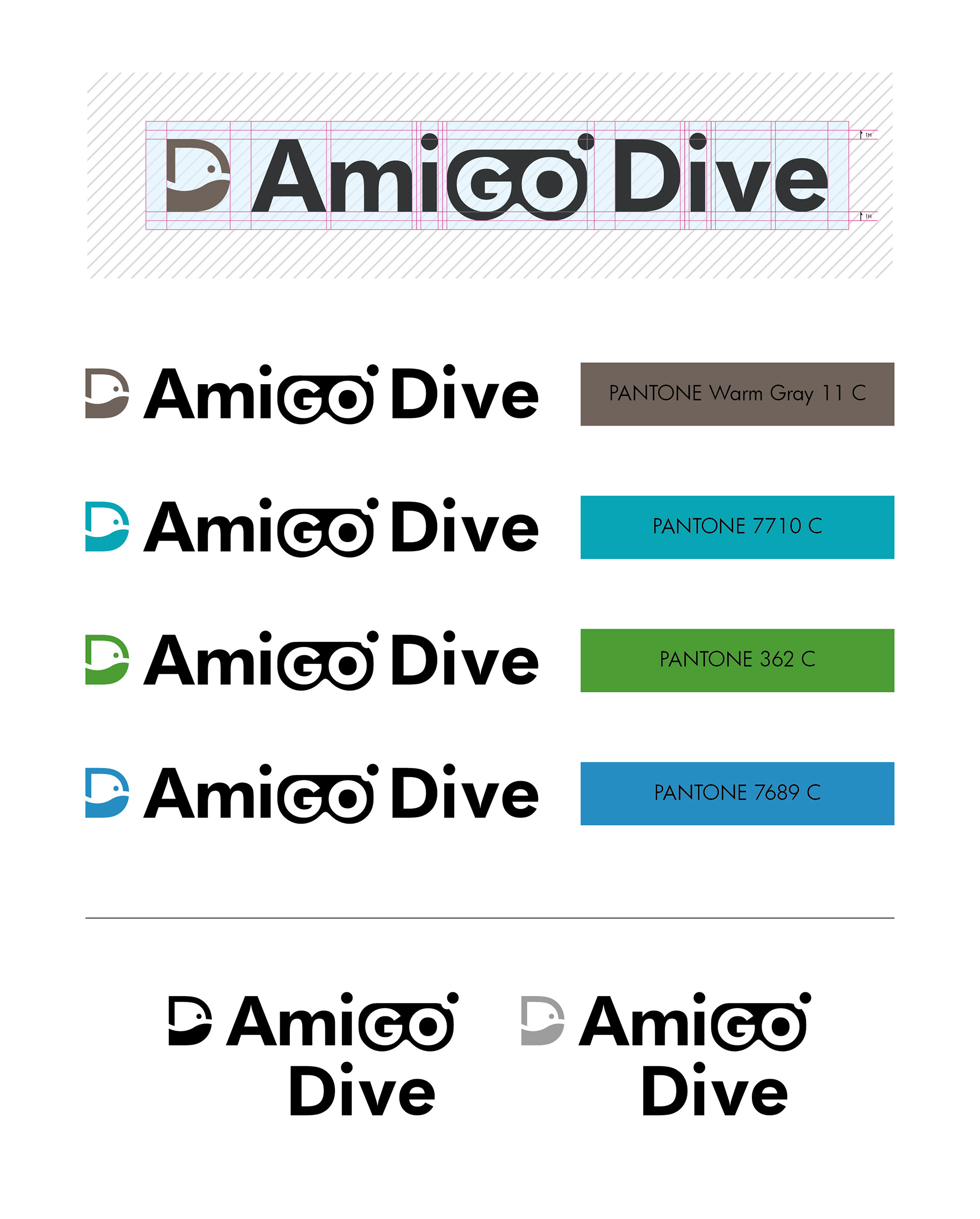
보홀에 위치한 '아미고 다이브'의 로고 디자인을 진행했습니다. 로고는 다이빙 브랜드의 정체성을 직관적으로 전달할 수 있도록 심볼 중심으로 디자인했습니다. ‘D’ 형태를 물고기 실루엣으로 표현해 보홀의 바다와 해양 환경을 상징적으로 담아냈으며, ‘GO’ 부분에는 다이빙 마스크(수경) 요소를 적용해 브랜드의 전문성과 특징을 자연스럽게 표현했습니다. 심플한 구조 안에서도 지역성과 업종의 특성이 명확하게 전달될 수 있도록 디자인했습니다. I designed the logo for ‘Amigo Dive,’ a diving brand located in Bohol. The logo was developed to clearly communicate the brand’s diving identity through a simple yet distinctive visual concept. The letter “D” was shaped into a fish-inspired symbol, representing Bohol’s marine environment and coastal character. Diving goggles were incorporated into the “GO” portion of the logotype, subtly reinforcing the brand’s connection to diving. The result is a clean and memorable logo that effectively reflects both the brand’s location and its specialty.