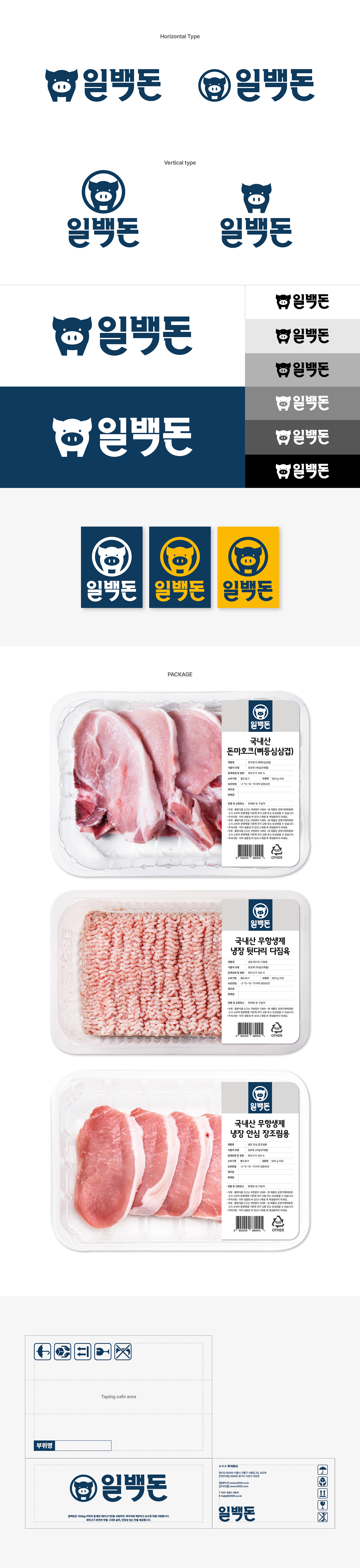
100kg 이하의 질 좋은 돼지고기만을 고집하는 일백돈의 로고타입, 심볼, 패키지 가이드 디자인을 진행했습니다. 심플하고 간결한 도형을 활용해 전체적인 디자인의 단순함에 초점을 맞췄으며, 한글 타이포그래피의 둥근 받침 형태를 통해 브랜드가 가진 긍정적이고 유니크한 이미지를 상징적으로 표현했습니다. 또한 매장에서 제품을 접했을 때 일관된 브랜드 아이덴티티가 자연스럽게 전달될 수 있도록 패키지 가이드를 함께 제작했으며, 브랜드의 네이비 컬러와 서브 배경 컬러가 조화롭게 어우러질 수 있도록 Pantone Cool Gray 1C를 지정해 전체적인 완성도를 높였습니다. I worked on the logotype, symbol, and package guideline design for Ilbaekdon, a brand dedicated to using only high-quality pork under 100kg. Simple and minimal geometric forms were used to emphasize clarity and simplicity throughout the design, while the rounded consonant endings in the Korean typography symbolically express the brand’s positive and distinctive character. In addition, package guidelines were developed to ensure a consistent brand identity across in-store applications, and Pantone Cool Gray 1C was selected to harmoniously balance the brand’s navy color with its supporting background tones, enhancing the overall visual completeness of the brand.