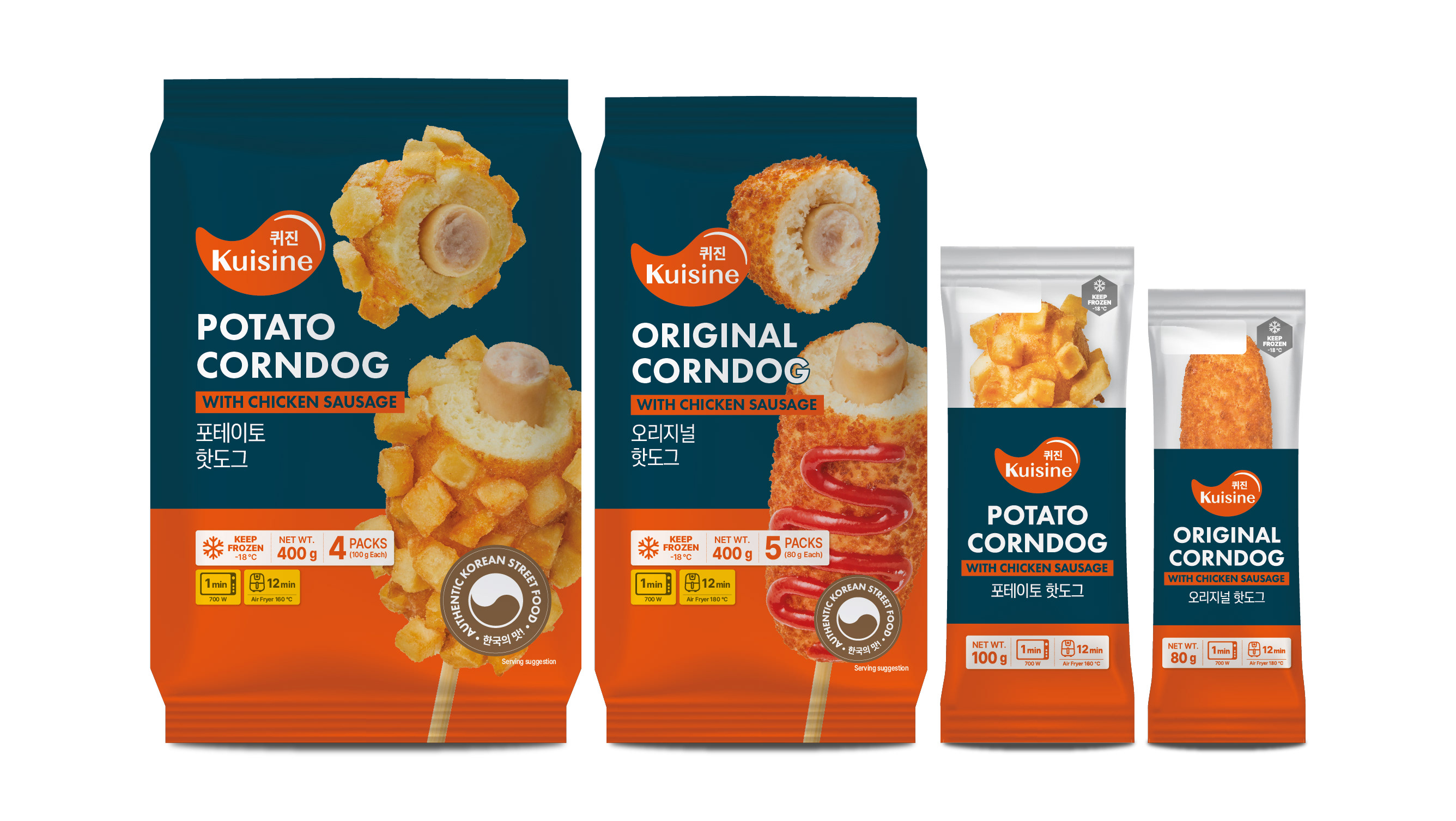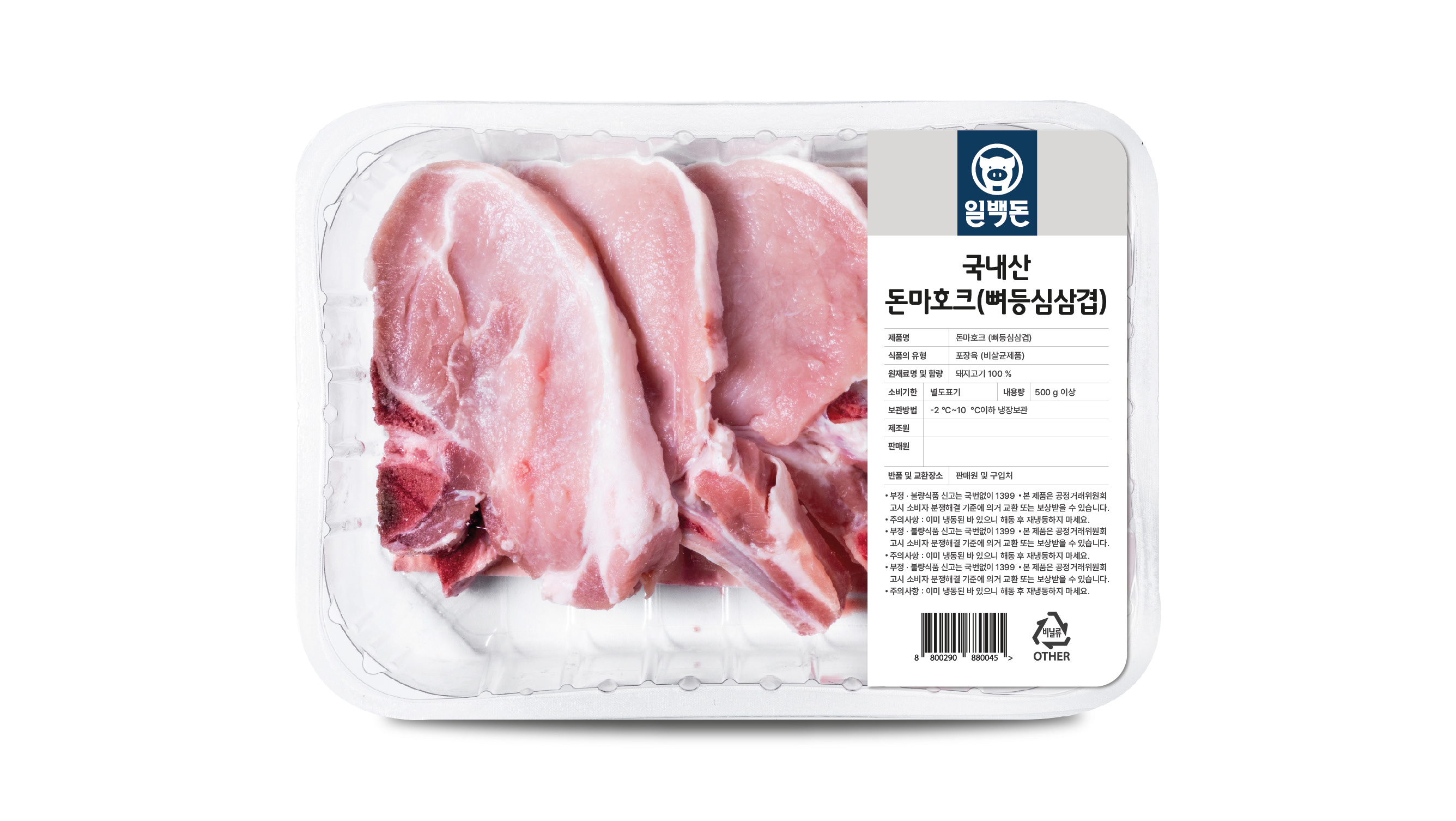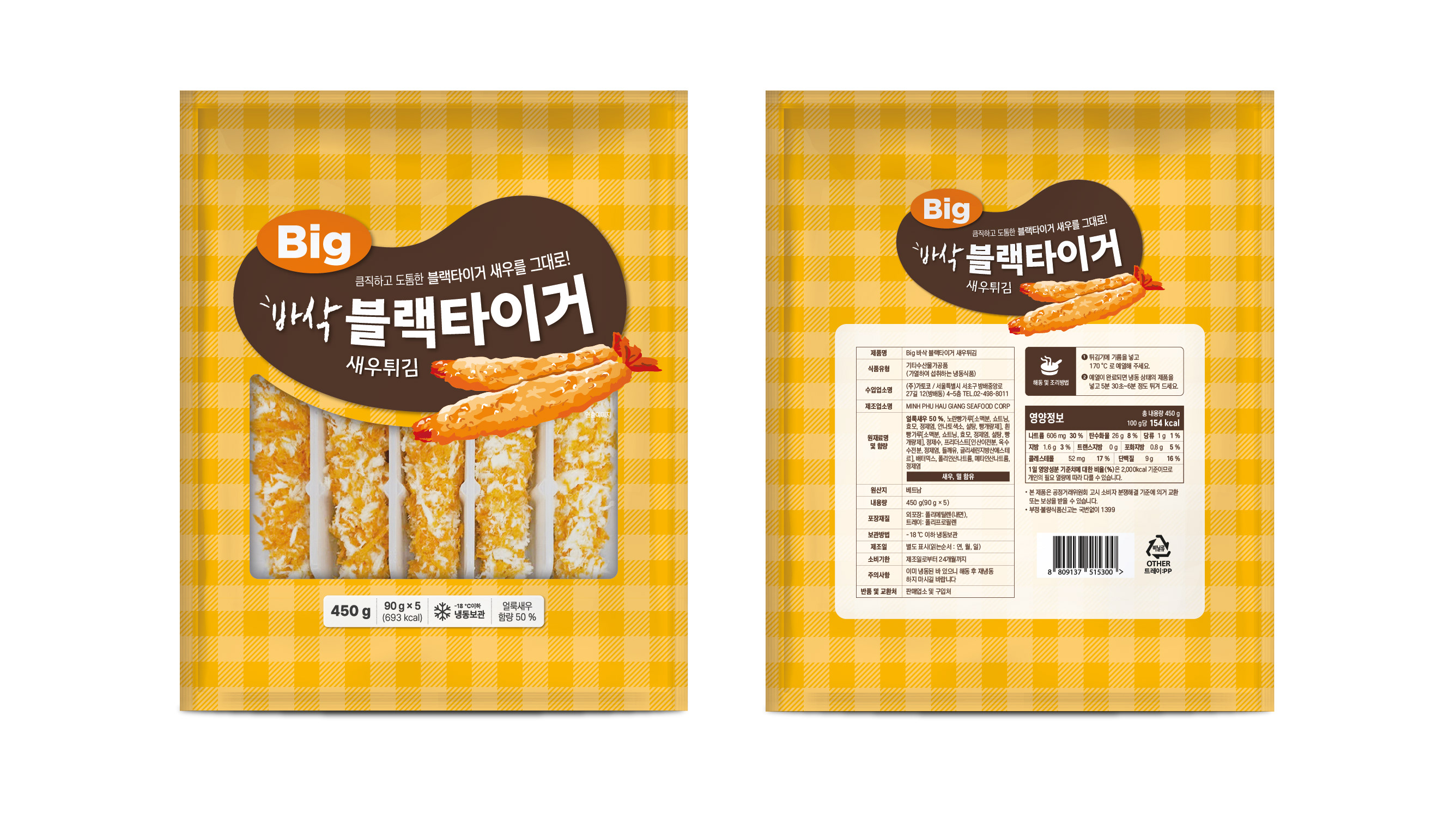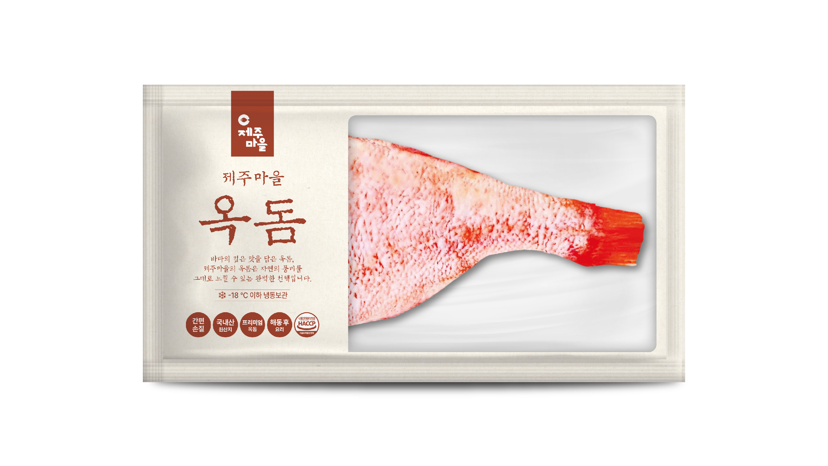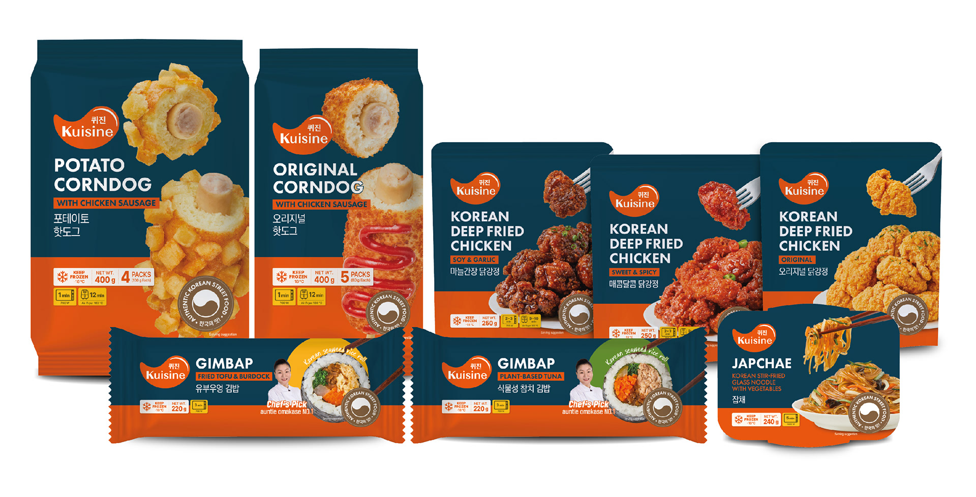
삼성웰스토리의 유럽 B2C 시장을 위한 Kuisine 패키지 디자인 및 가이드를 제작했습니다. 다양한 한식 제품군에 동일하게 적용할 수 있는 패키지 가이드를 개발해, 제품별 규격과 형태가 달라도 하나의 브랜드 라인업으로 인식될 수 있도록 디자인했습니다. 삼성웰스토리의 시그니처 컬러인 Vital Orange를 메인 컬러로 사용하고, 남색을 함께 조합해 냉동·냉장 진열 환경에서도 높은 주목도를 확보하고자 했습니다. 또한 음식 이미지를 비교적 크게 배치해 메뉴의 특징을 직관적으로 전달하고 제품의 식감을 효과적으로 강조했습니다. I worked on the package design and packaging guidelines for Kuisine, a Samsung Welstory brand developed for the European B2C market. A unified packaging system was created to be applied across a wide range of Korean food products, ensuring that items of different sizes and formats would still be recognized as part of the same product family. Samsung Welstory’s signature Vital Orange was used as the primary color, complemented by navy accents to maximize shelf visibility in refrigerated and frozen retail environments. Large food photography was also incorporated to clearly communicate each menu item and enhance its visual appeal.