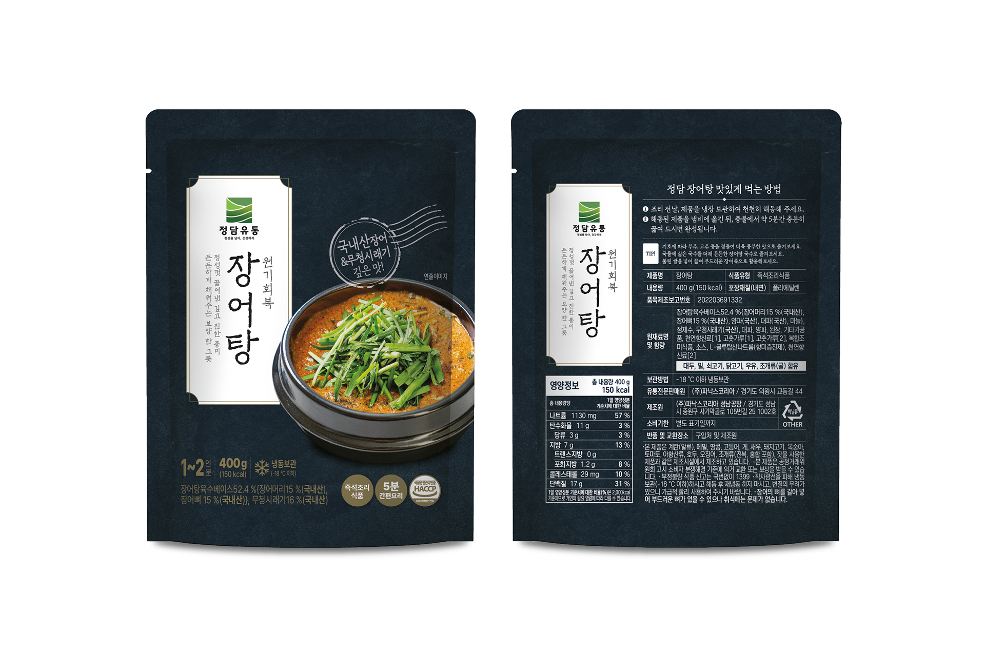
정담유통의 장어탕 패키지 디자인을 진행했습니다. 제품의 프리미엄 이미지를 강조하기 위해 어두운 톤의 대리석 텍스처를 배경으로 활용하고, Pantone 골드 컬러를 포인트로 적용해 고급스럽고 묵직한 분위기를 표현했습니다. 또한 한식의 전통성이 자연스럽게 느껴질 수 있도록 질감이 살아있는 폰트를 메인 서체로 사용해 브랜드만의 정통성과 신뢰감을 담아내고자 했습니다. 전반적으로 전통적인 한식의 가치와 프리미엄 식품의 이미지를 조화롭게 전달하는 데 중점을 두고 디자인했습니다. I worked on the package design for Jeongdam Distribution’s Eel Soup. To emphasize the product’s premium positioning, a dark marble-inspired texture was used as the background, while Pantone gold accents were incorporated to create a refined and luxurious atmosphere. A textured typeface inspired by traditional Korean aesthetics was selected as the main font, reinforcing the authenticity and heritage of Korean cuisine. The overall design was developed to balance the richness of a premium food product with the warmth and tradition of Korean culinary culture.