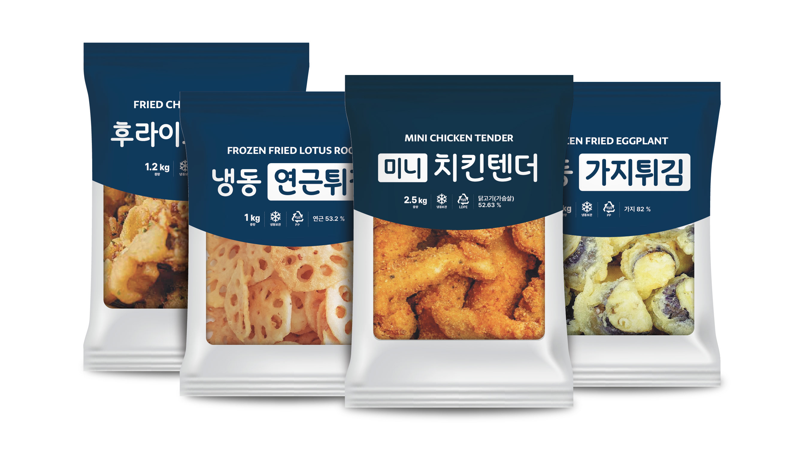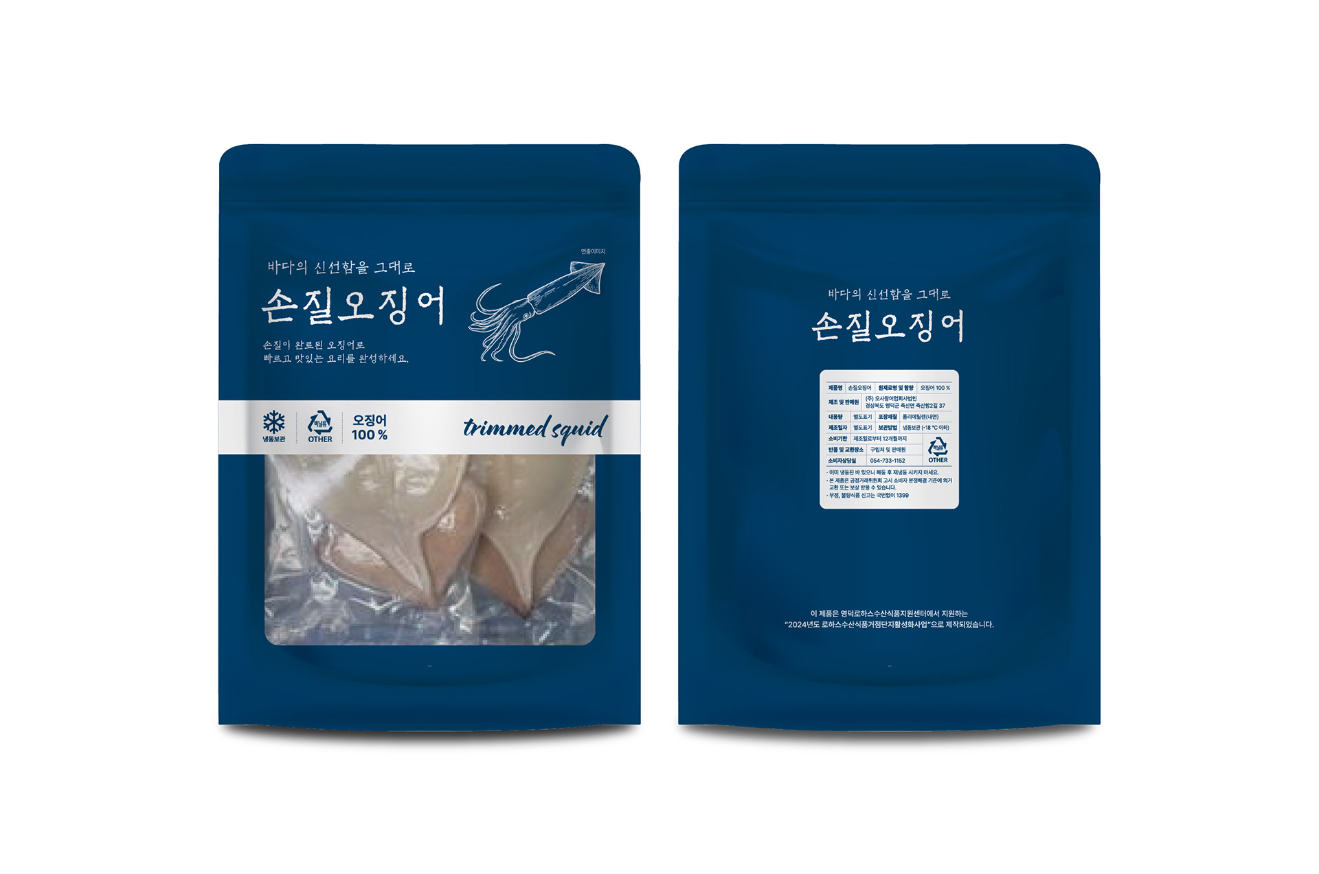
오사랑 손질오징어의 패키지 디자인을 진행했습니다. 남색, 흰색, 검정색의 3가지 컬러만을 활용해 제작비 효율성과 시각적 완성도를 동시에 고려했으며, 제한된 색상 안에서도 수산물 특유의 신선함과 신뢰감을 효과적으로 전달하고자 했습니다. 불필요한 요소를 최소화한 간결한 구성과 선명한 정보 전달에 집중해 제품의 특징이 한눈에 드러날 수 있도록 디자인했습니다. I worked on the package design for Osarang Prepared Squid. The design was created using only three colors—navy, white, and black—to balance production efficiency with visual impact. Within this limited color palette, the goal was to effectively communicate the freshness and reliability associated with seafood products. A clean and minimal layout was developed to ensure clear communication and allow the product’s key features to stand out at a glance.