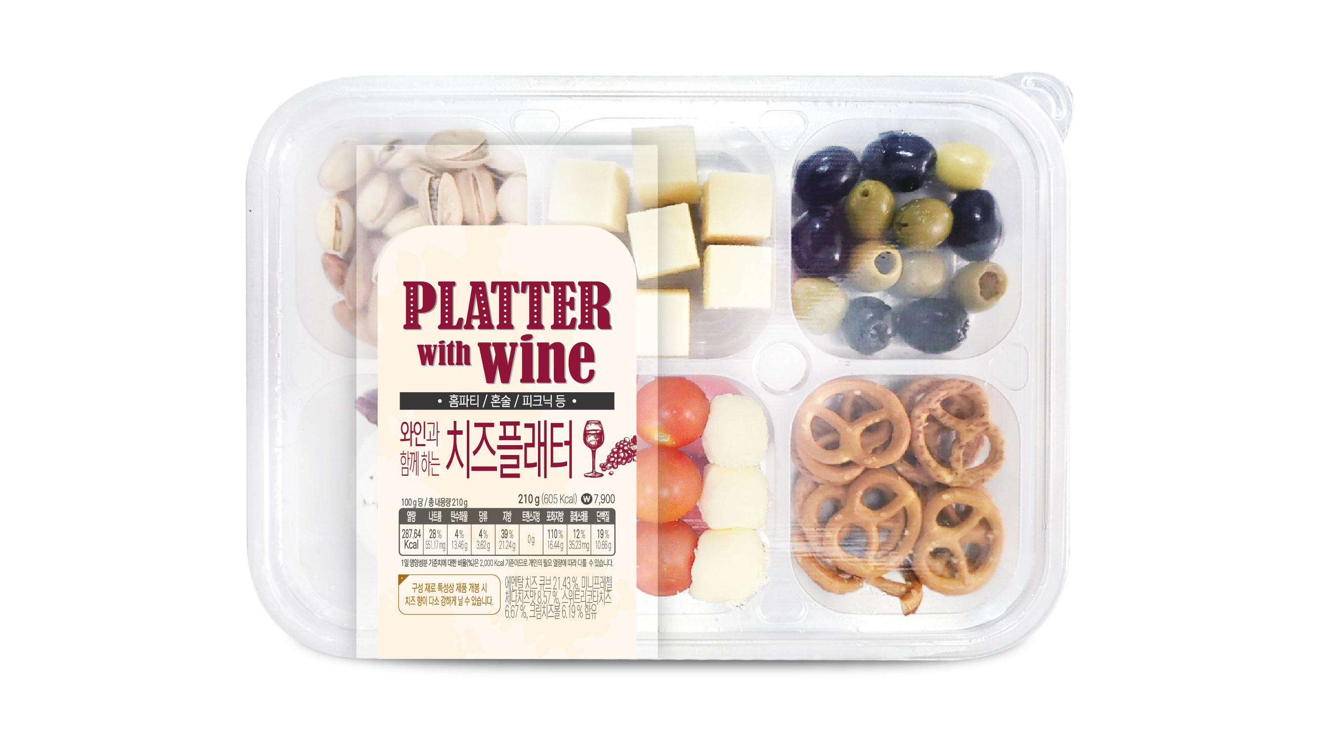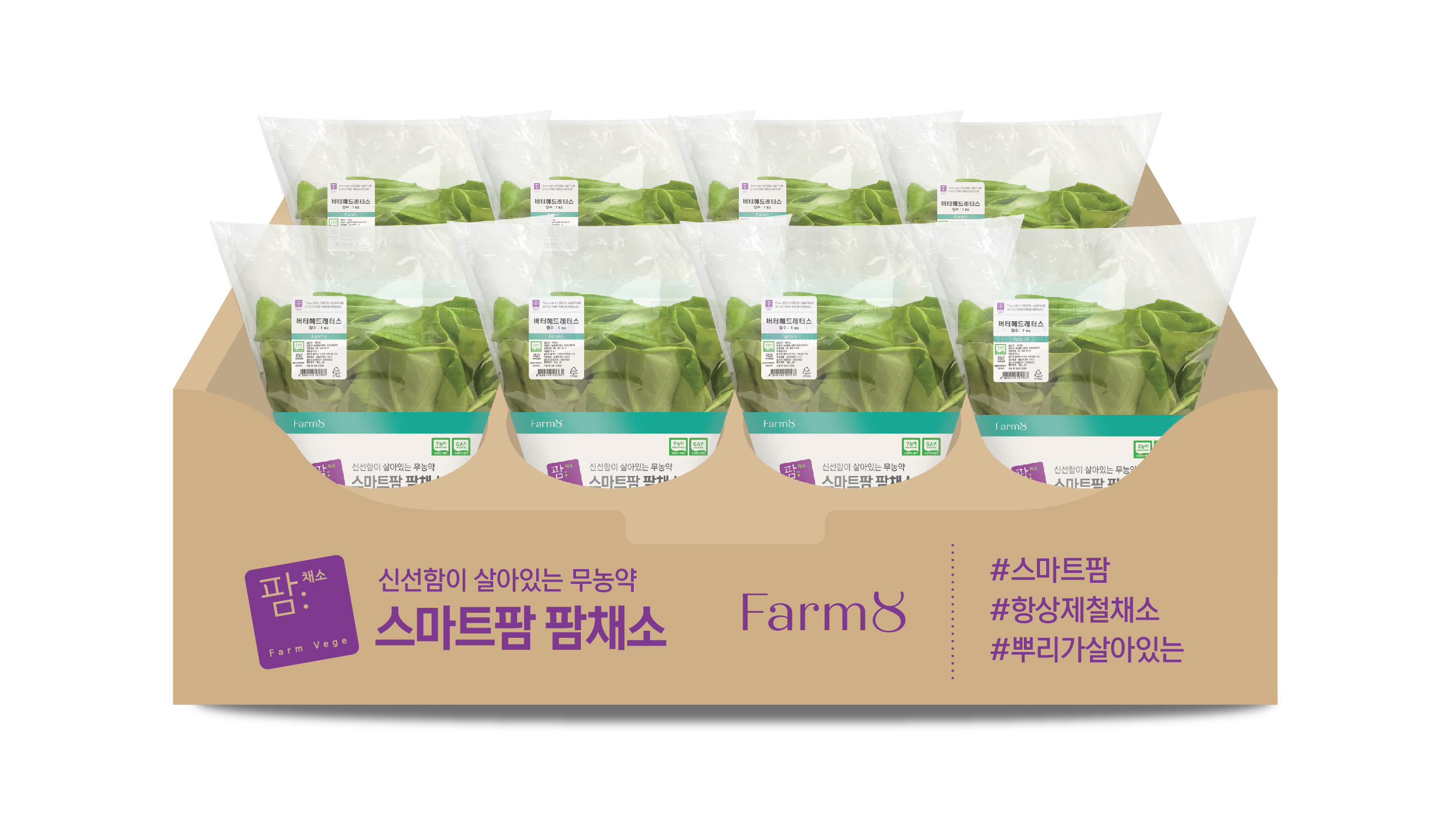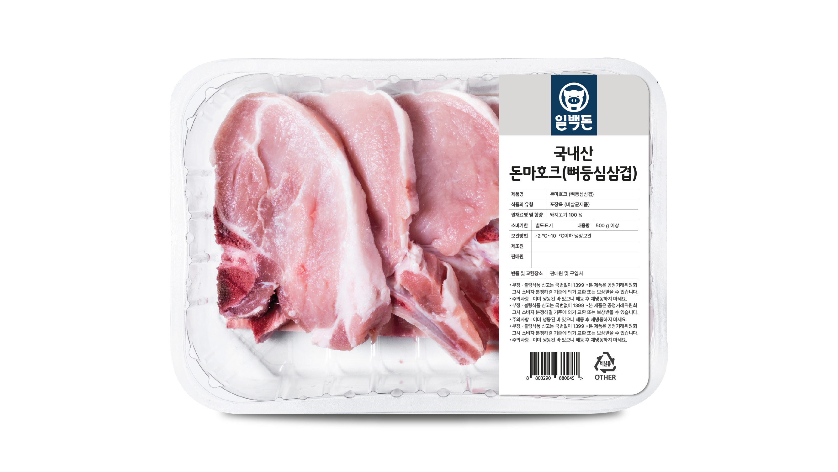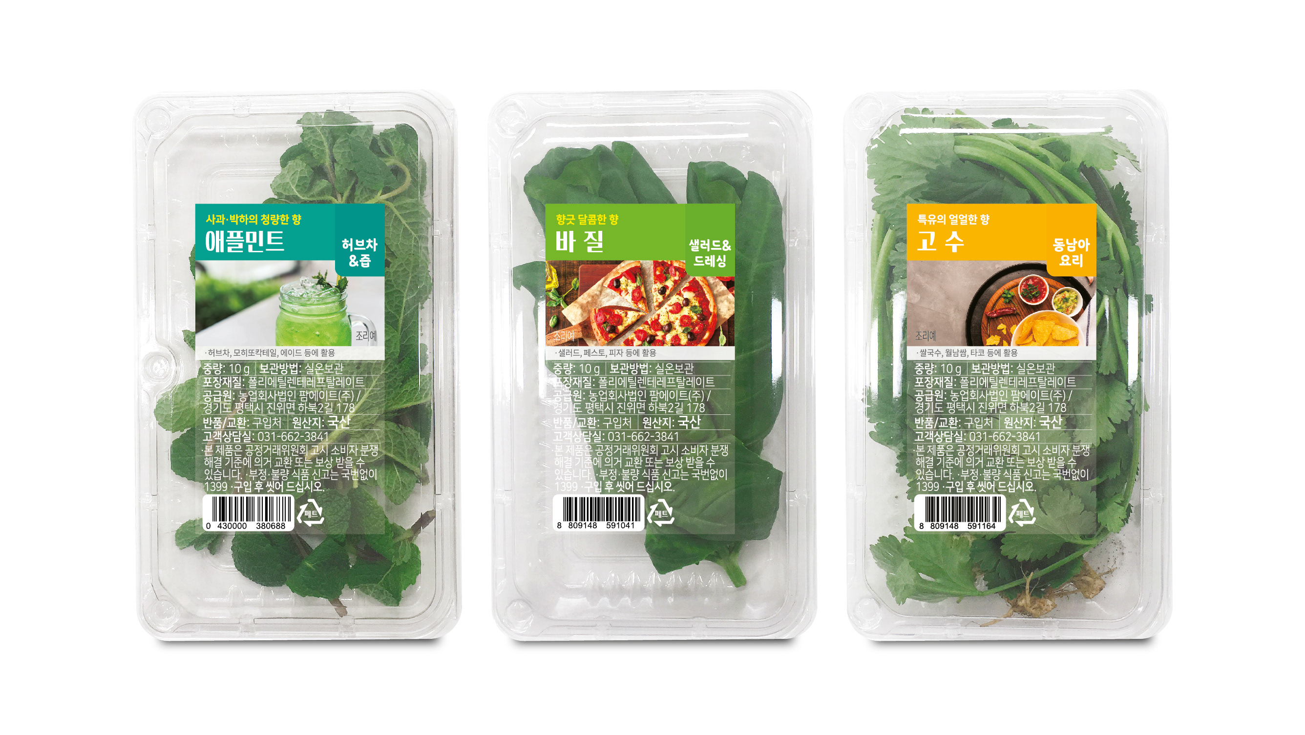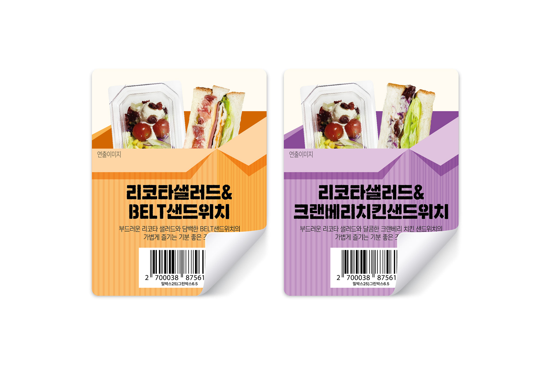
GS25에서 판매되는 그린박스 2종의 라벨 스티커 디자인을 진행했습니다. 제품명인 ‘그린박스’의 콘셉트를 시각적으로 표현하기 위해 라벨 전체를 박스 형태의 그래픽으로 구성하고, 그 안에 주요 정보를 정리해 담았습니다. 2종 제품이 자연스럽게 구분될 수 있도록 은은한 파스텔톤 컬러를 적용했으며, 깔끔한 레이아웃을 통해 정보 전달력과 시인성을 높이고자 했습니다. I worked on the label sticker design for two Green Box products sold at GS25. To visually reflect the concept behind the name “Green Box,” the entire label was designed around a box-shaped graphic structure, with key product information organized within it. Soft pastel colors were used to distinguish the two variants, while a clean layout helped improve readability and overall visual clarity.