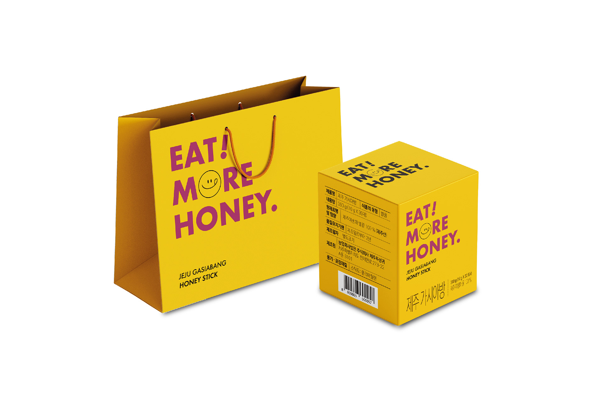
제주 가시아방 허니스틱 박스 및 쇼핑백 디자인을 진행했습니다. 꿀 제품에서 흔히 떠올리는 전통적이고 무거운 이미지를 벗어나기 위해 전면에 영문 타이포그래피를 크게 배치하고, 보다 현대적이고 감각적인 분위기로 디자인했습니다. 이를 통해 젊은 소비자층에게도 친숙하고 세련된 패키지로 인식될 수 있도록 했으며, 박스와 쇼핑백 전반에 통일된 디자인 요소를 적용해 브랜드 아이덴티티를 강화했습니다. I worked on the box and shopping bag design for Jeju Gasiabang Honey Sticks. To move away from the conventional and traditional image often associated with honey products, bold English typography was prominently featured on the front of the design, creating a more modern and stylish appearance. This approach helped position the product as an attractive and approachable package for younger consumers, while consistent visual elements across both the box and shopping bag reinforced the overall brand identity.