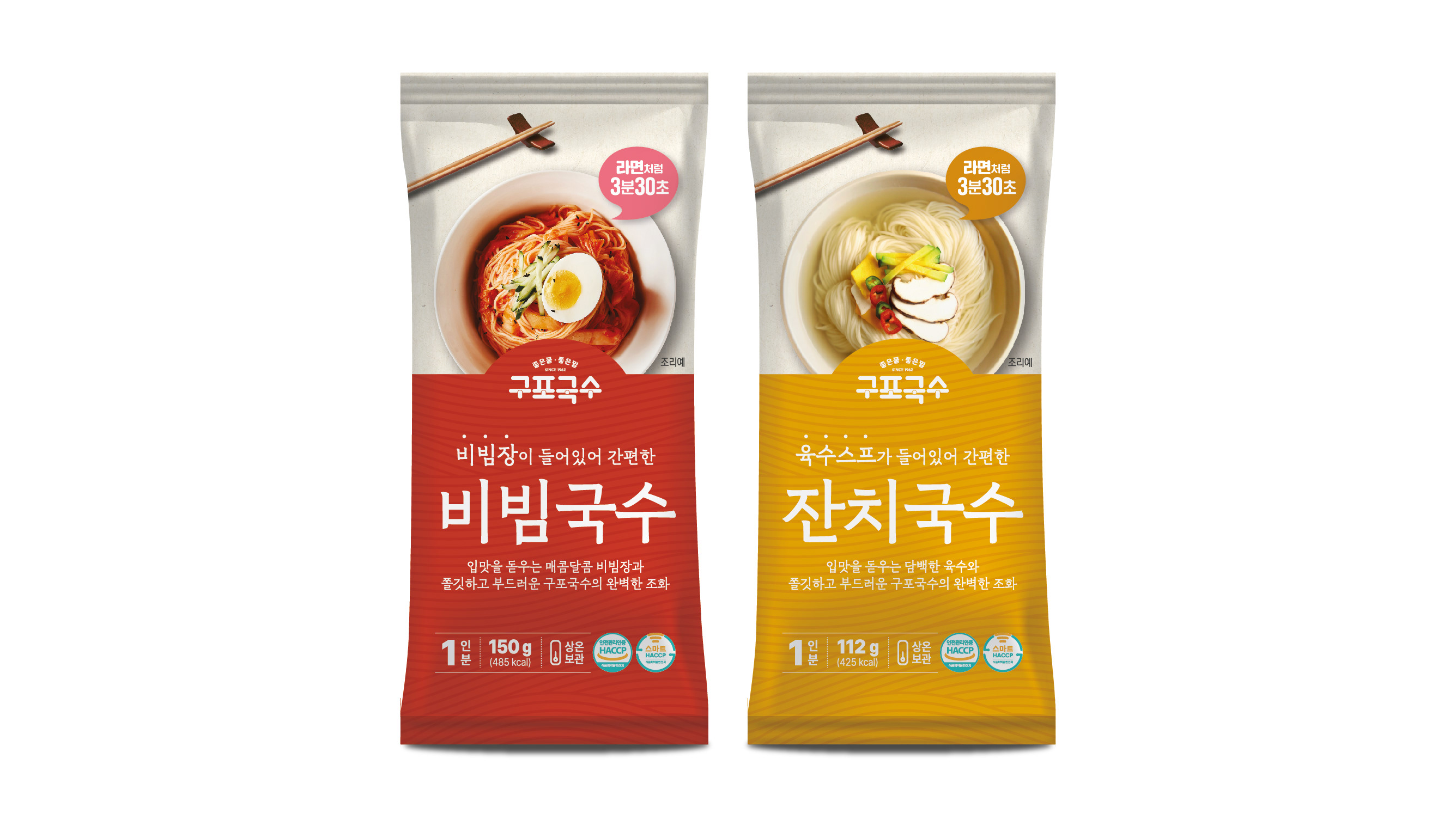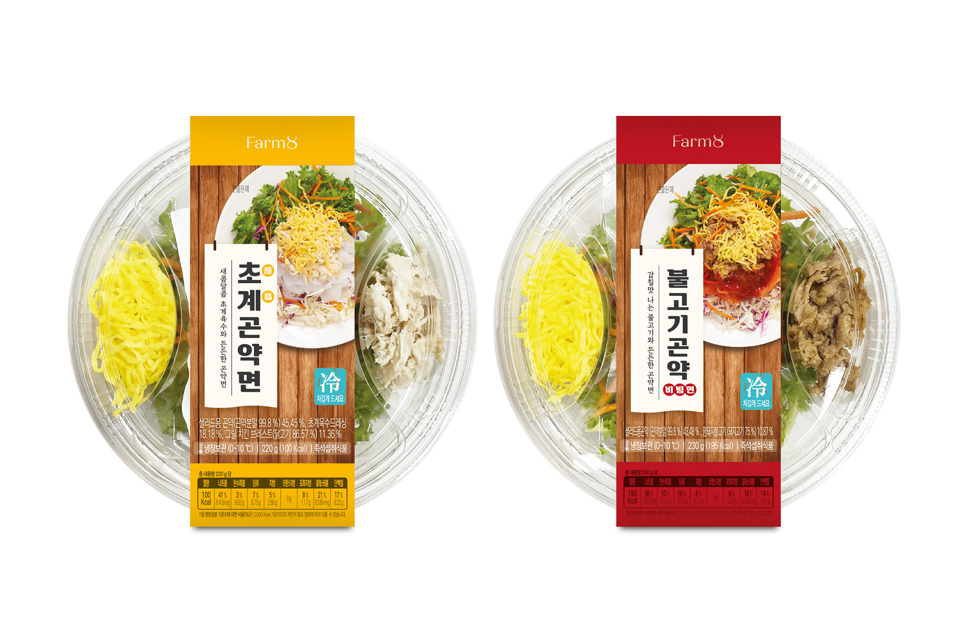
CU에 판매된 곤약면 2종 패키지 디자인을 진행했습니다. 진열대에서 눈에 잘 띌 수 있도록 선명한 원색 계열의 컬러를 적용했으며, 면 요리 전문점의 노렌(暖簾)을 연상시키는 천 형태의 그래픽 안에 주요 정보를 배치해 음식점 같은 분위기를 표현하고자 했습니다. 제품의 특징이 직관적으로 전달될 수 있도록 구성하면서도 친근하고 개성 있는 패키지로 디자인했습니다. I worked on the package design for two Konjac Noodle products sold at CU. Bold primary colors were used to enhance shelf visibility, while key product information was placed within a fabric-inspired graphic resembling a traditional Japanese noren curtain, creating the atmosphere of a noodle restaurant. The design was developed to communicate the product clearly while delivering a distinctive and approachable visual identity.